Project Overview

Artífice is an editorial design project that explores the influence of contemporary artists on modern culture through the disciplines of music, dance, and visual arts. Conceived as a cultural magazine, the publication translates extensive research into an engaging editorial experience, highlighting how aesthetics, visual language, and artistic expression shape contemporary society. Rather than presenting information as isolated articles, the project builds a cohesive publication that balances cultural storytelling with a carefully structured reading experience.

The design process began with topic definition, audience identification, content planning, and editorial strategy before progressing into in-depth research for each article. Competitive references and existing publications informed decisions regarding structure, hierarchy, and visual communication, while conceptual development established the magazine's identity under the name Artífice. From there, the project evolved through editorial planning, information organization, content development, layout exploration, and the production of a complete publication supported by realistic presentation mockups. Throughout the process, research and editorial decisions continuously informed the visual direction, resulting in a publication that integrates cultural content with a consistent and engaging reading experience.

Duration

3 months

Industry

Editorial Design

Location

Mexico

Project Overview

Artífice is an editorial design project that explores the influence of contemporary artists on modern culture through the disciplines of music, dance, and visual arts. Conceived as a cultural magazine, the publication translates extensive research into an engaging editorial experience, highlighting how aesthetics, visual language, and artistic expression shape contemporary society. Rather than presenting information as isolated articles, the project builds a cohesive publication that balances cultural storytelling with a carefully structured reading experience.

The design process began with topic definition, audience identification, content planning, and editorial strategy before progressing into in-depth research for each article. Competitive references and existing publications informed decisions regarding structure, hierarchy, and visual communication, while conceptual development established the magazine's identity under the name Artífice. From there, the project evolved through editorial planning, information organization, content development, layout exploration, and the production of a complete publication supported by realistic presentation mockups. Throughout the process, research and editorial decisions continuously informed the visual direction, resulting in a publication that integrates cultural content with a consistent and engaging reading experience.

Duration

3 months

Industry

Editorial Design

Location

Mexico

Services

Branding Editorial Design Graphic Design Creative Direction

Client

Artifice

Graphic Design

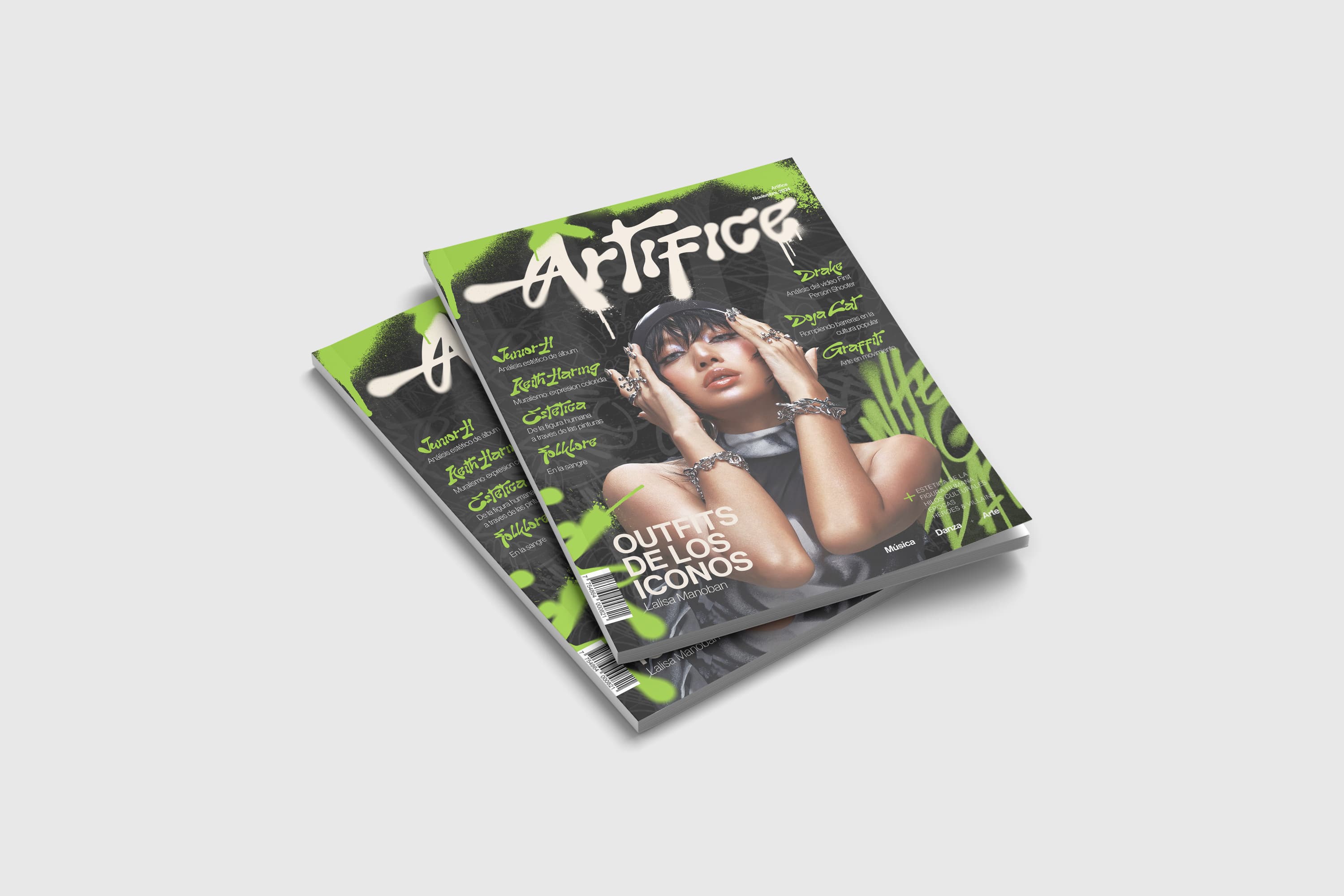
The visual identity of Artífice is built around a contemporary editorial aesthetic inspired by street culture, music, and modern artistic expression. A restrained dark foundation is contrasted with vibrant neon green accents and expressive graffiti-inspired typography, creating an energetic visual language that immediately reflects the publication's cultural focus. Strong photographic covers, expressive display typography, and carefully balanced editorial compositions establish a recognizable identity while reinforcing the magazine's artistic personality across every section.

The visual identity of Artífice is built around a contemporary editorial aesthetic inspired by street culture, music, and modern artistic expression. A restrained dark foundation is contrasted with vibrant neon green accents and expressive graffiti-inspired typography, creating an energetic visual language that immediately reflects the publication's cultural focus. Strong photographic covers, expressive display typography, and carefully balanced editorial compositions establish a recognizable identity while reinforcing the magazine's artistic personality across every section.

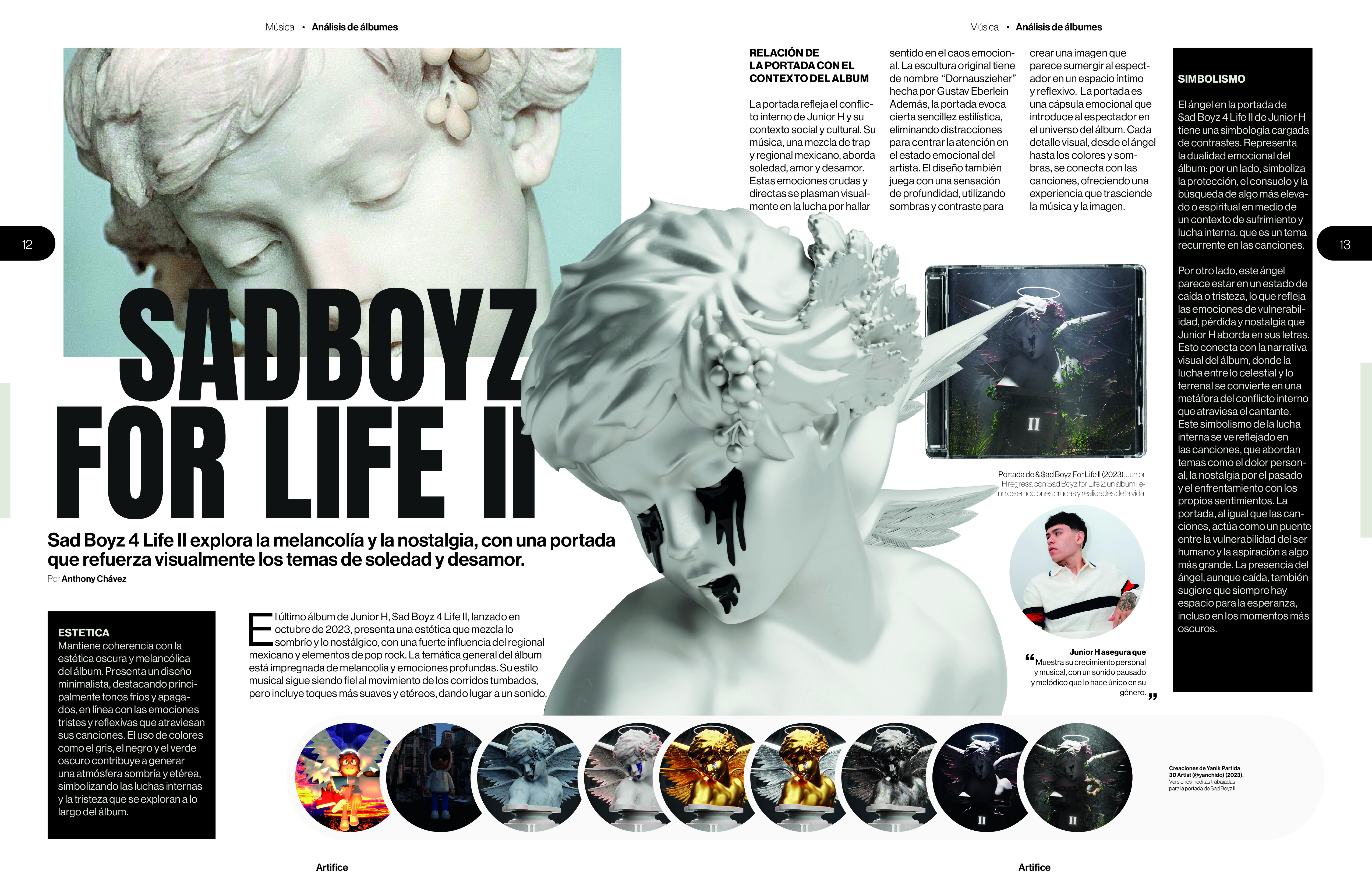
ypography, grid systems, and visual hierarchy play a central role in the reading experience. Modular layouts organize large volumes of editorial content into structured spreads, combining generous white space, consistent alignment, and clearly differentiated headline, subheading, and body text styles. Photography, illustrations, and supporting graphics are integrated through a coherent composition system that prioritizes readability without sacrificing visual impact. References gathered during the analysis of existing magazines informed many of these editorial decisions, particularly regarding hierarchy, cover composition, and the balance between imagery and text, resulting in a publication that feels both contemporary and professionally produced.

Two dandelion clocks with motion blur in high-contrast monochrome—ethereal botanical study.
Ethereal dandelion seed heads in soft gradient light—fine filaments rendered in monochrome.
Black liquid droplet forming a near circle on white—minimal abstract ink splash.
Black-and-white macro of a dandelion seed head on white—delicate botanical detail.

Collaborators

Donovan Canizales, Andrea Lopez, Ashley Carrasco, Montserrat Gonzales

Date

Creative Direction

Graphic design functions as more than decoration—it becomes the primary communication tool of the publication. Every visual decision, from color selection and typography to layout rhythm and image placement, reinforces the magazine's narrative while improving usability and reader engagement. The consistent application of editorial design principles creates a unified system capable of accommodating diverse cultural topics while maintaining a strong and recognizable visual identity throughout the publication.

Graphic design functions as more than decoration—it becomes the primary communication tool of the publication. Every visual decision, from color selection and typography to layout rhythm and image placement, reinforces the magazine's narrative while improving usability and reader engagement. The consistent application of editorial design principles creates a unified system capable of accommodating diverse cultural topics while maintaining a strong and recognizable visual identity throughout the publication.